Same waiver as in Pt1 as to my lack of economic training. Oh and it’s probably better to read this series in chronological order.
Despite the figures seeming to point to a Mr McCawber outcome of misery due to our public spending being about £3,000 more per person than our public income and a Ma Broon “Michty me” warning ringing in our ears, surely there’s other ways to look at it.
What does the HM Revenue & Customs say?
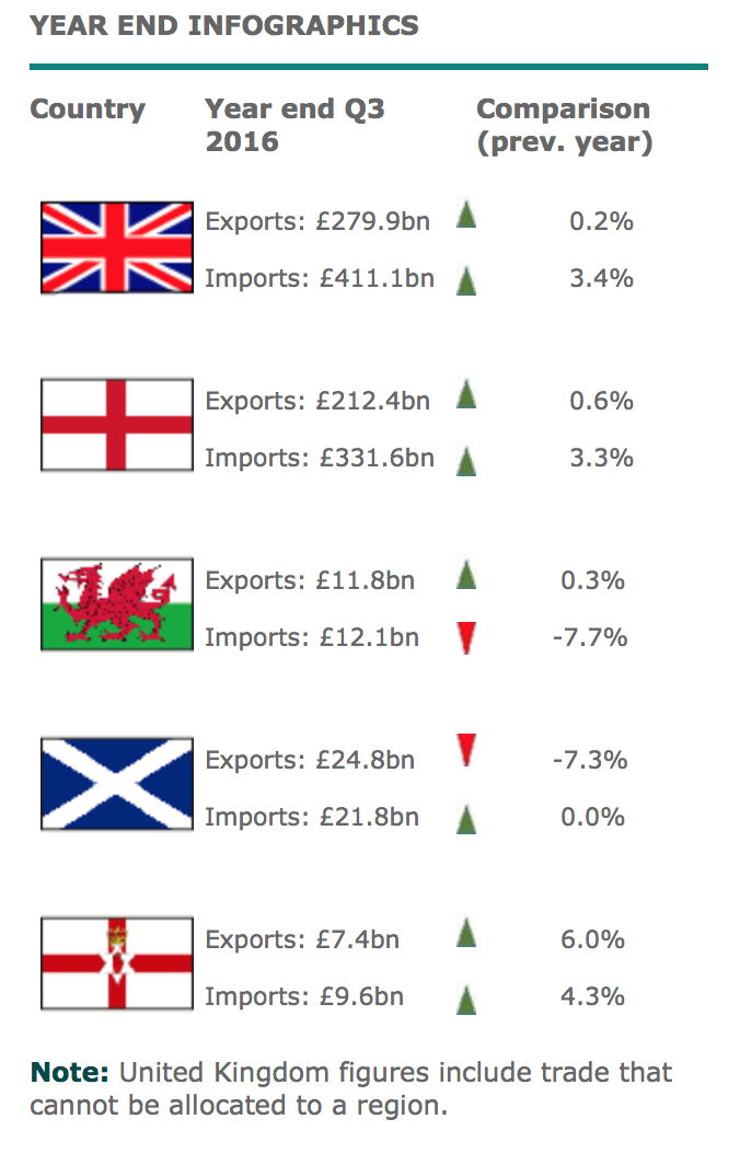
Very handily, HMRC provide UK trade info broken down into geographical regions. Here is one of their current graphs, showing trade info for the Year to end of September 2016.

Notice anything? Scotland is the only home nation to be running a profit in trade! And that’s despite our exports being 7% down on the previous year because of the current oil price slump which hits Scottish disproportionately more than the rest of the UK.
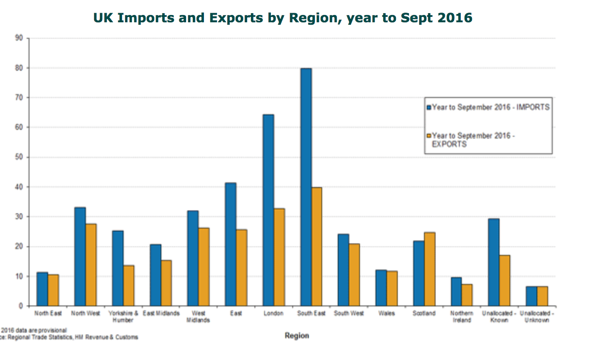
Here’s another graph:

Notice anything here? London and the SE seem to account for most of the UKs import / export balance. I’m not informed enough to know if these trade figures include services like the banking sector. If they don’t then it would skew the London figures massively. So I won’t comment further.
No, actually I will comment further. Overall UK is running a massive trade gap while Scotland is running a modest trade surplus despite a big drop in the value of one of our main exports. But I can imagine that our international import-export trade surplus, while accurate, can’t be the whole story. I mean Scotland must “import” a lot from rUK which rUK has already imported from outside the UK so in effect rUK becomes our importer by proxy.
Hummpphh. Still, knowing we have a trade surplus is encouraging.


